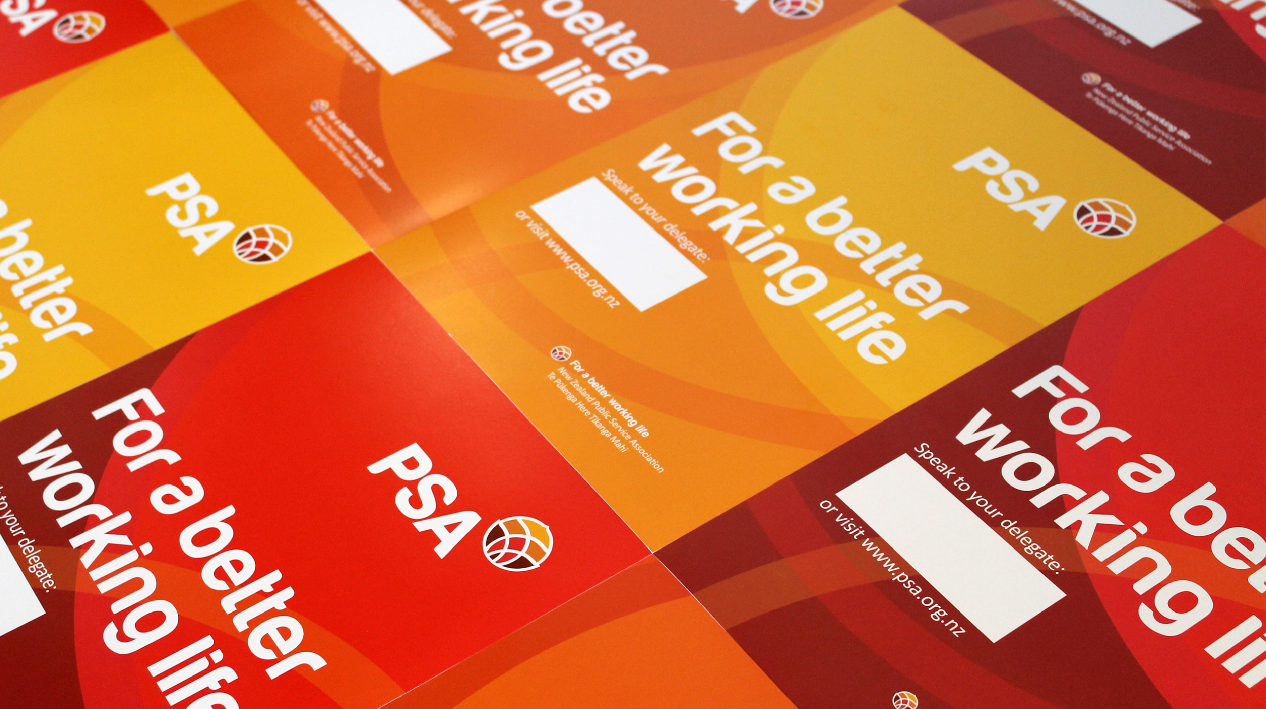
A brand for the future
Brief
As New Zealand’s largest and oldest union, the PSA has a great deal to be proud of. But there’s always more work to do seeking better conditions and fair treatment for New Zealand’s public sector workers – so while recognising the PSA’s legacy, the rebranding process was all about creating a brand for the future.
Approach
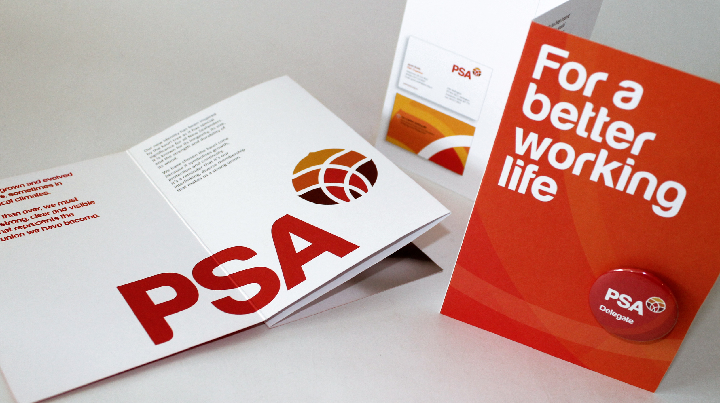
At the heart of the visual identity created for the PSA is a new logo marque. The kauri reflects the size, strength and longevity of the union – embodied in the kauri seed, to deliver a message of renewal, growth and moving forward.
Outcome
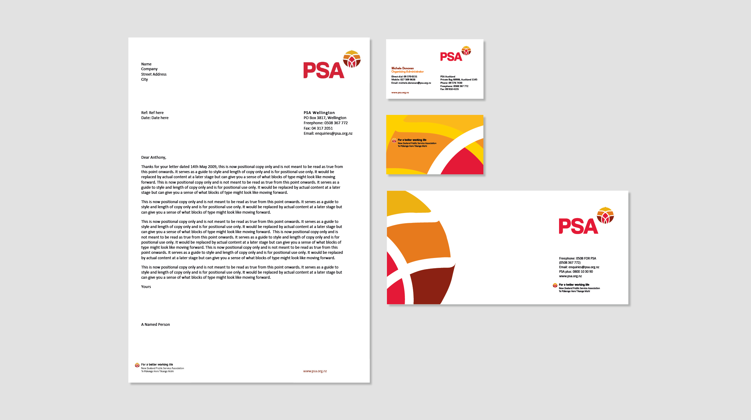
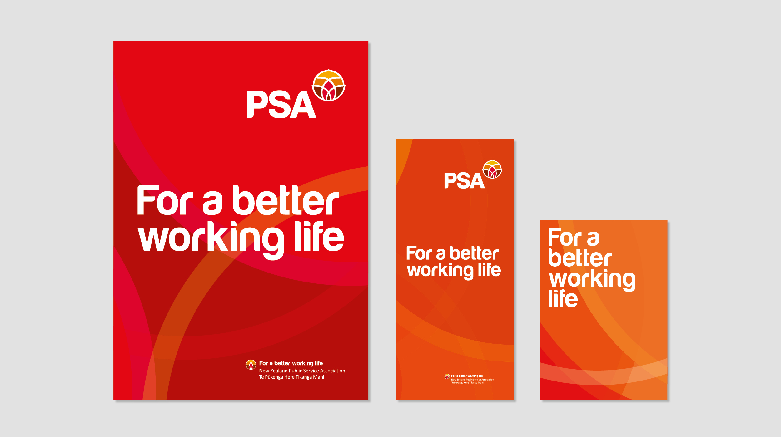
With a new brand that is easy to apply across a wide range of materials, using a colour palette where the traditional red is accompanied by vibrant colours that support positive and active messaging, the PSA remains highly visible as it embarks on its second century of protecting and enhancing rights for workers.
