
It’s better to be safe…
Brief
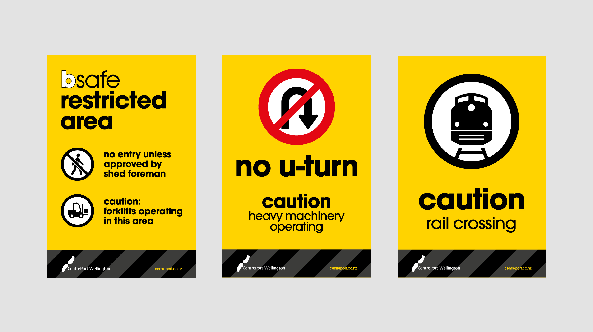
A busy port, heavy machinery and a diverse range of users from workers to cruise ship passengers all lead to a need for safety to be a top priority. Our job was to make the safety messages highly visible, eyecatching and easy to follow.
Approach
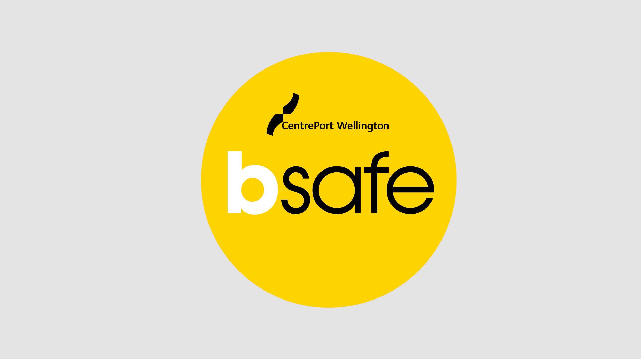
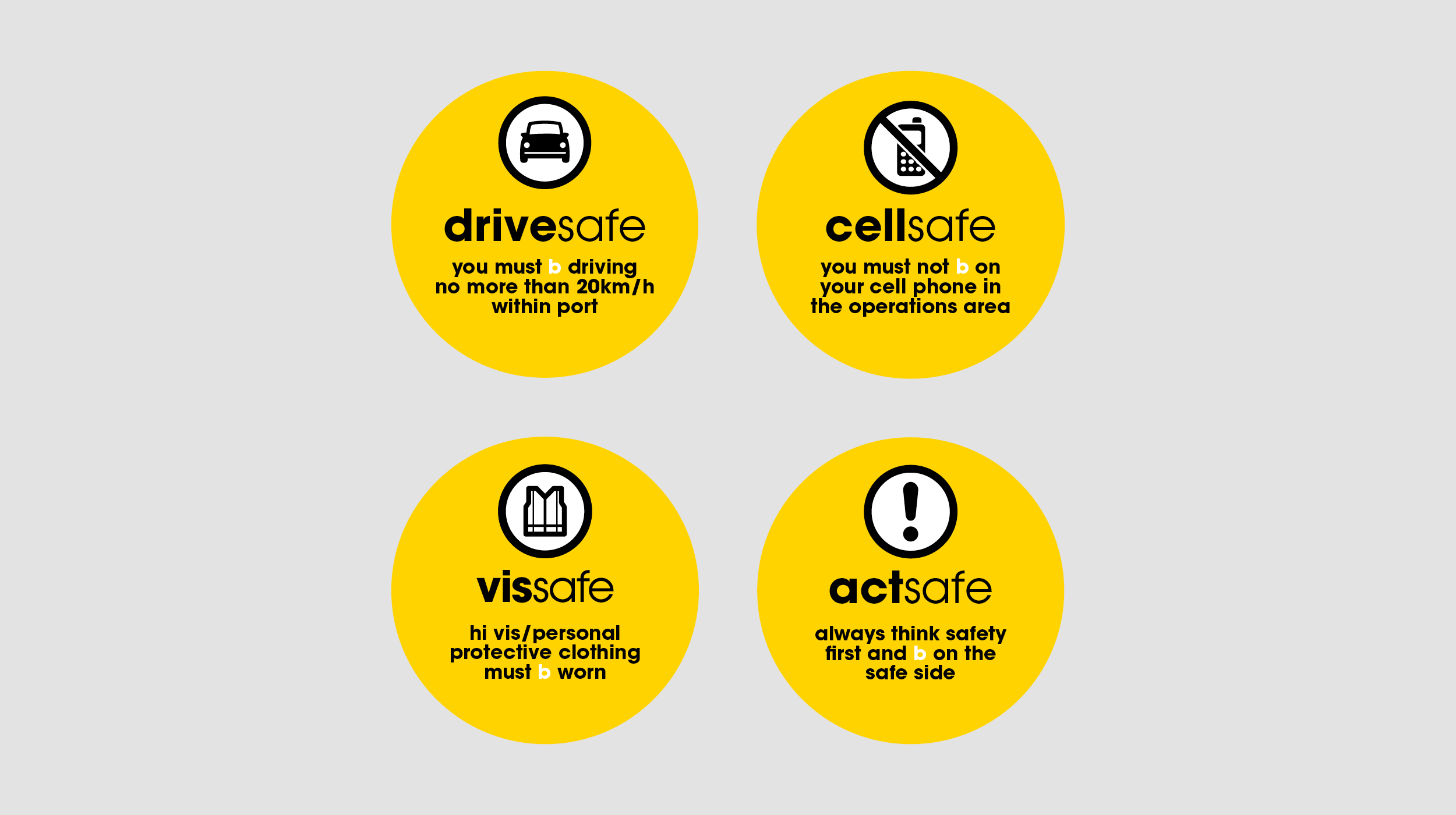
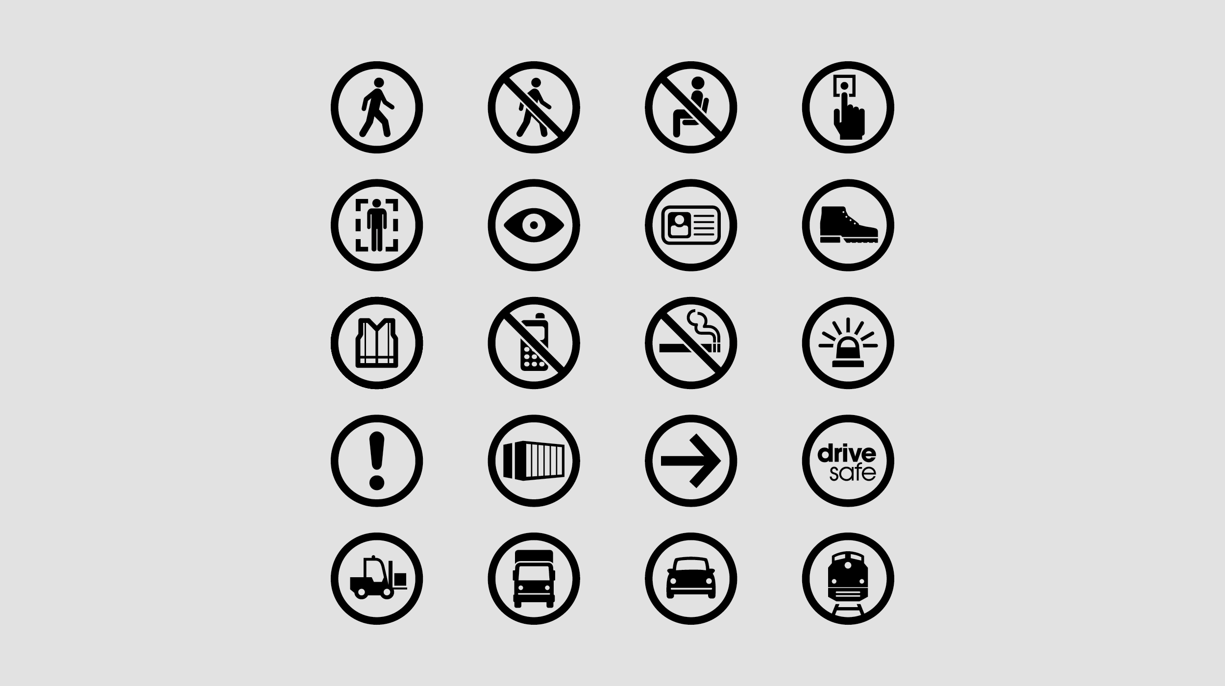
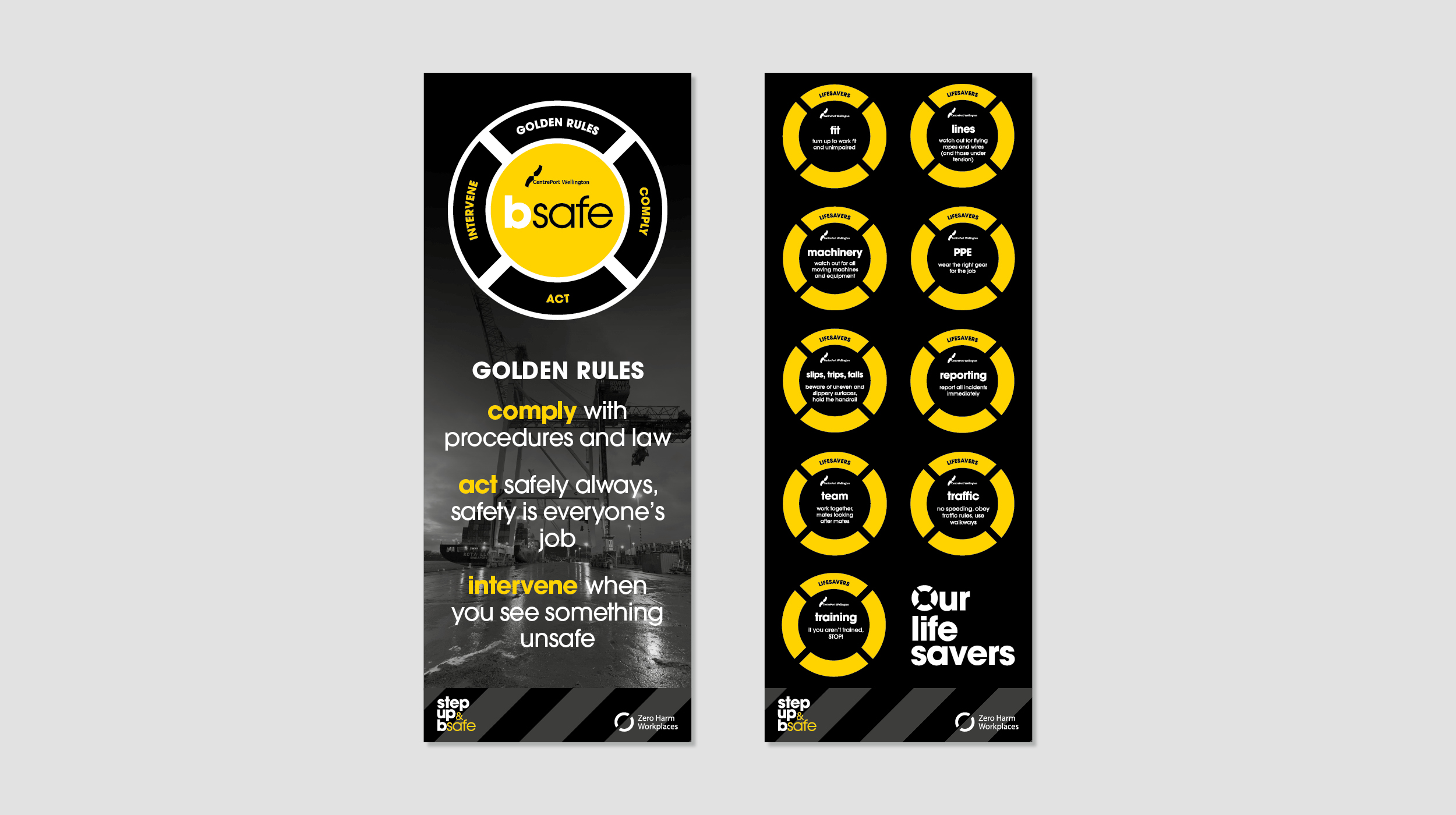
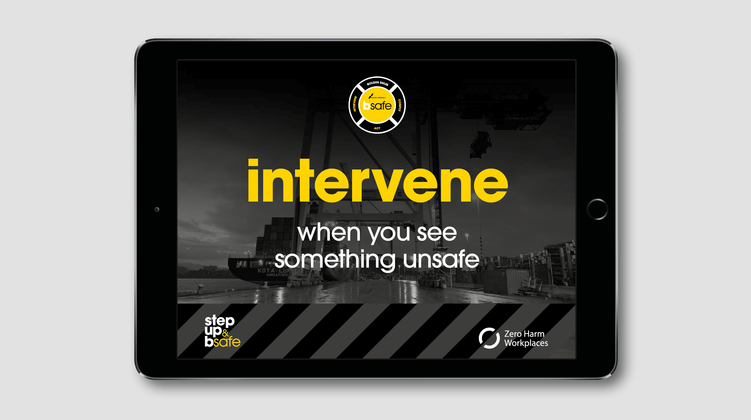
We created the bsafe brand – a core message that was clear, easy to remember, and flexible and extendable in its application. It’s supported by a bold colour palette, strong visual messages and icons, and an extensive and innovative approach to application.
Outcome
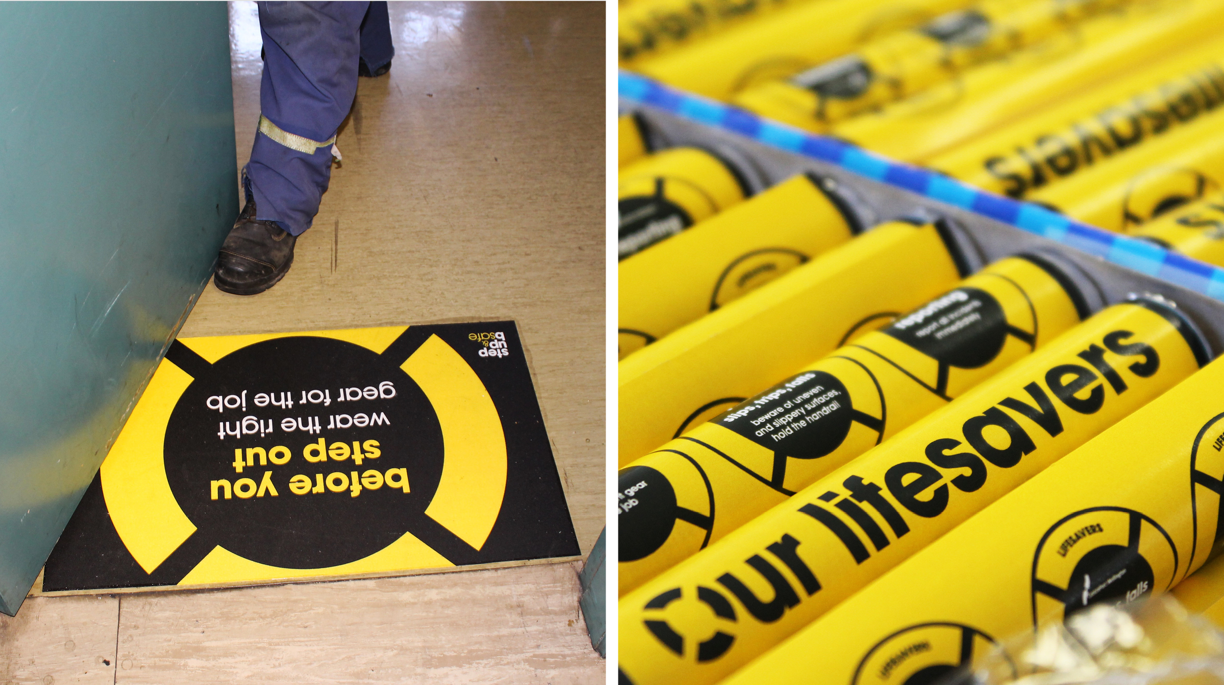
Take a walk around the Port and you can’t get away from the safety messaging, which can only be a good thing. The bsafe brand continues to be evolved and adapted to ensure that whether you’re a one-off visitor to the Port, or work there every day, safety remains top of mind.