Horticulture NZ Annual Report
Brief
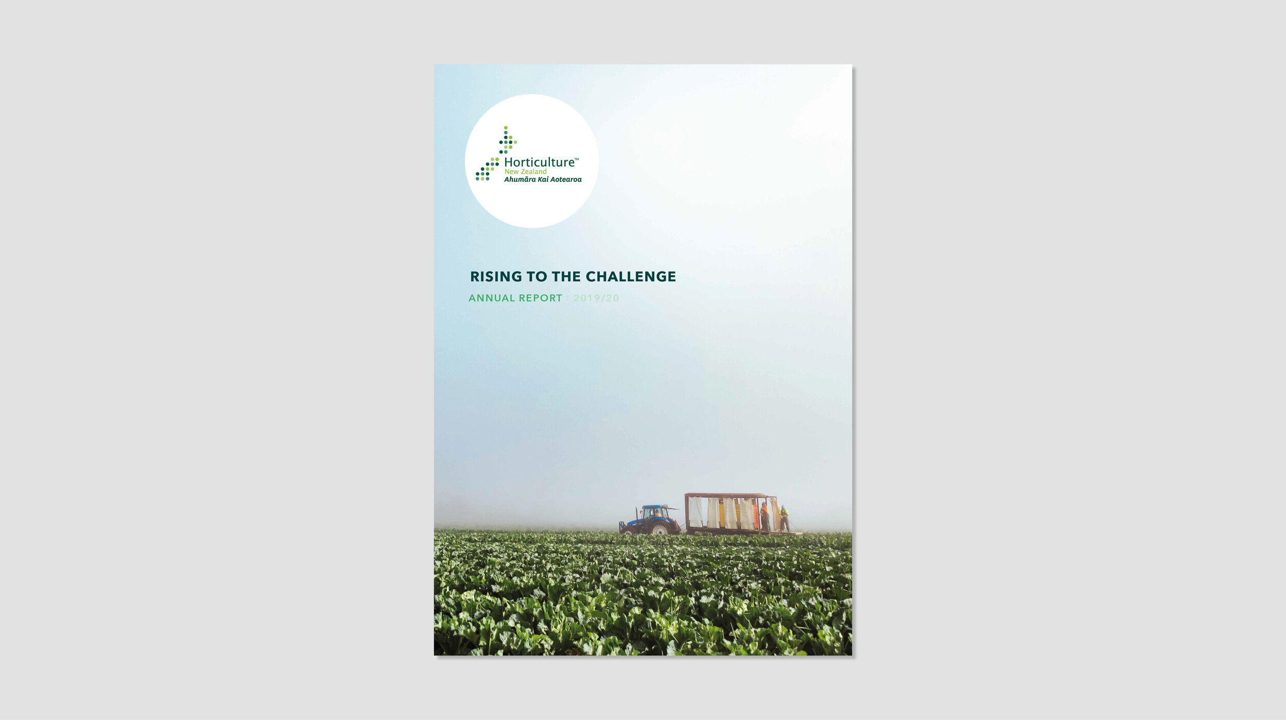
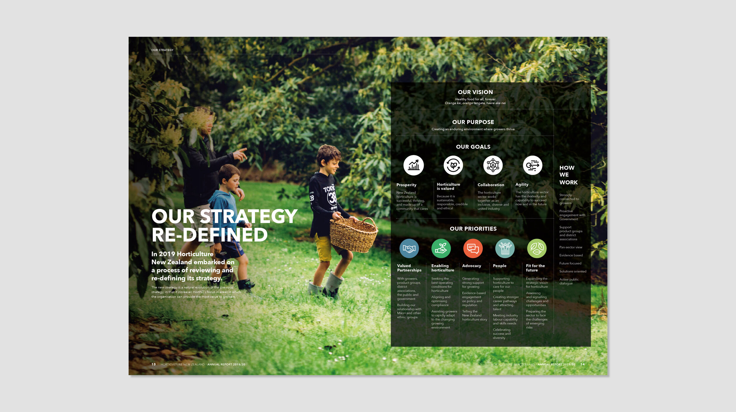
Horticulture New Zealand had recently re-defined their brand strategy, and the Annual Report was the perfect opportunity to bring it to life and demonstrate both the value HortNZ delivers to members and the contribution the sector makes to New Zealand.
It was also the perfect chance to review the HortNZ brand to make it modern, fresh and world-class – just like the produce grown in New Zealand’s horticulture sector.
Approach
With the strategy top-of-mind, we flipped last year’s annual report on its head to tell an engaging story. Opening the cover, rather than encountering a table of contents, the first thing you see is HortZ’s vision.
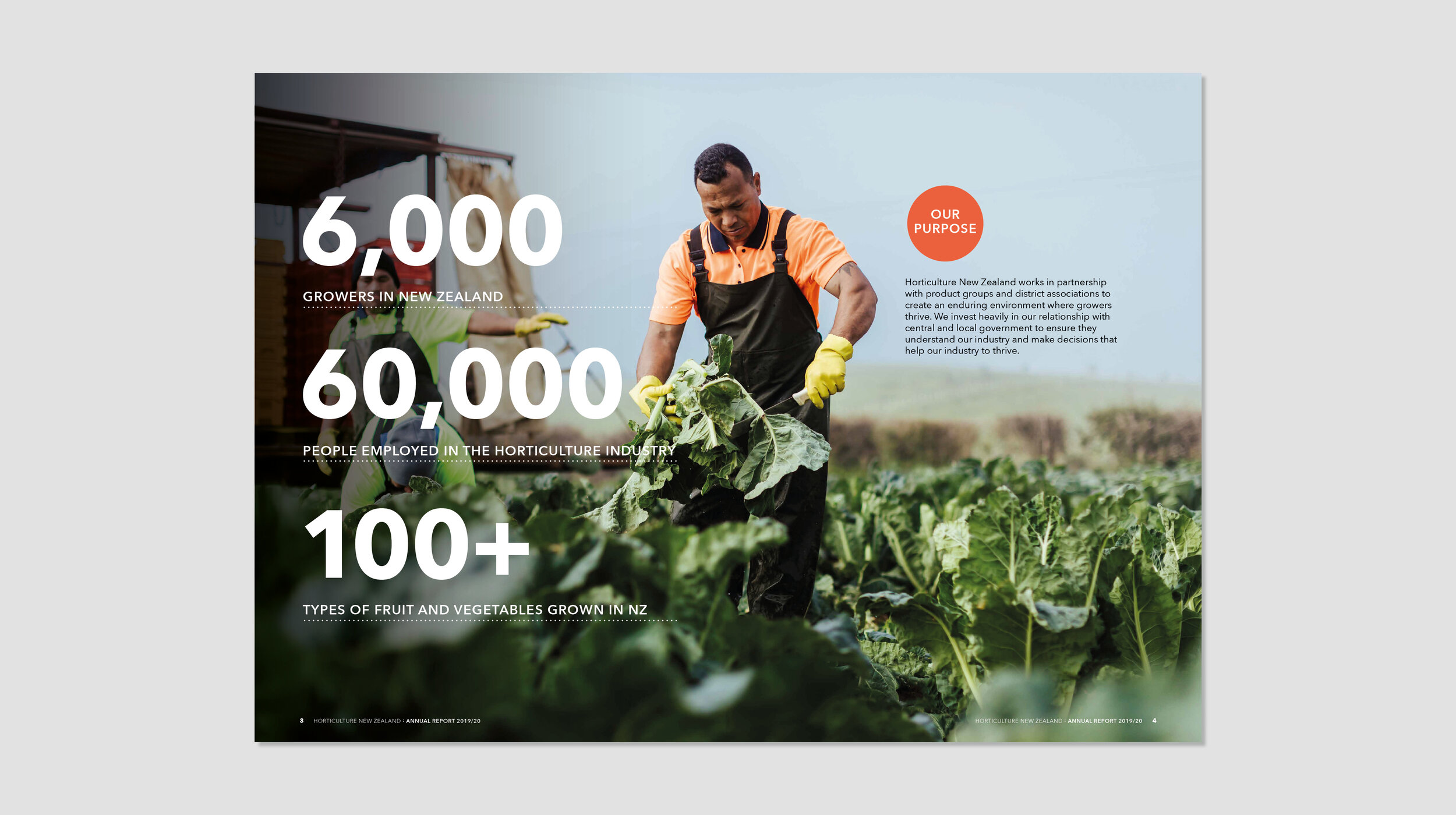
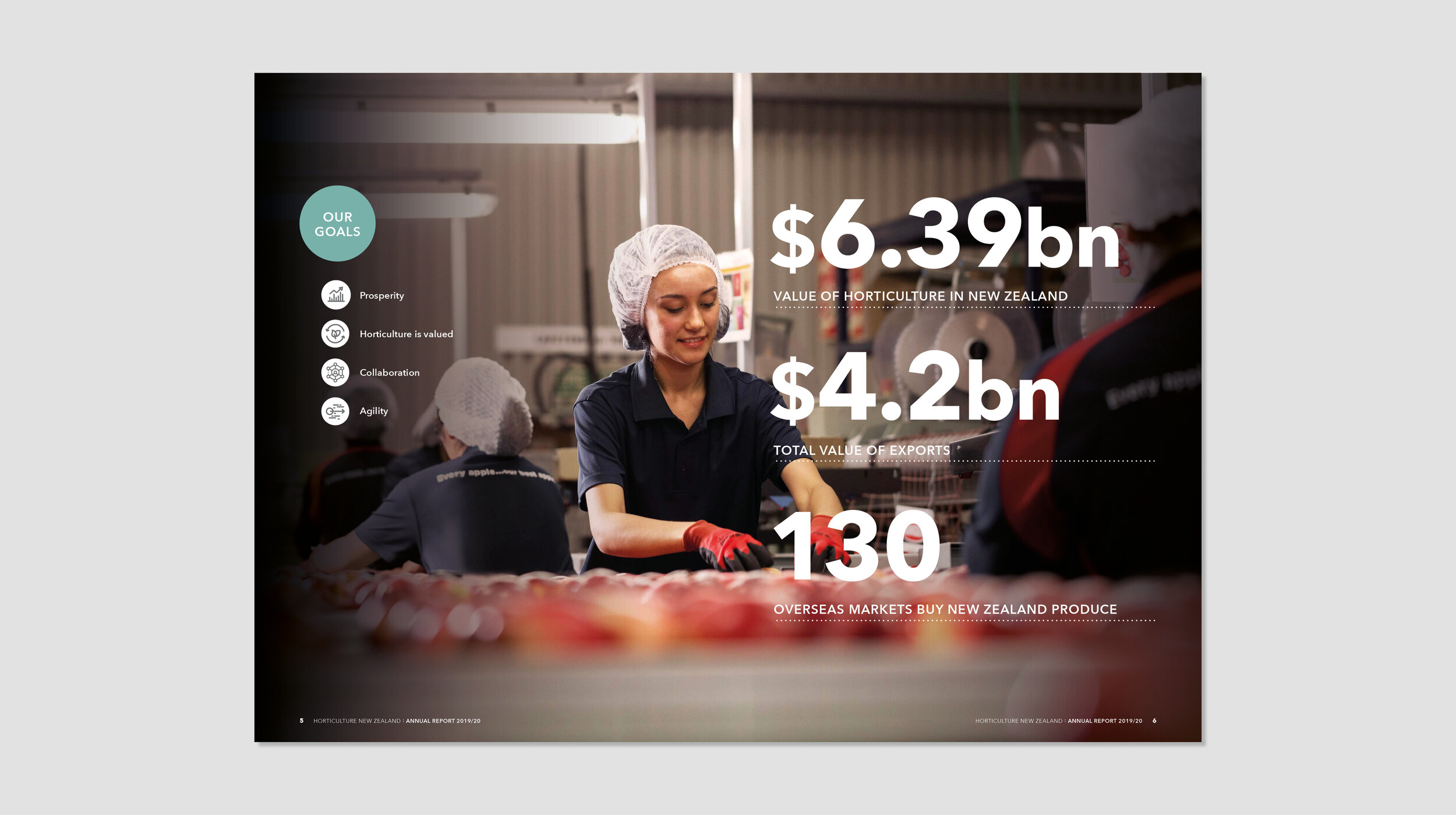
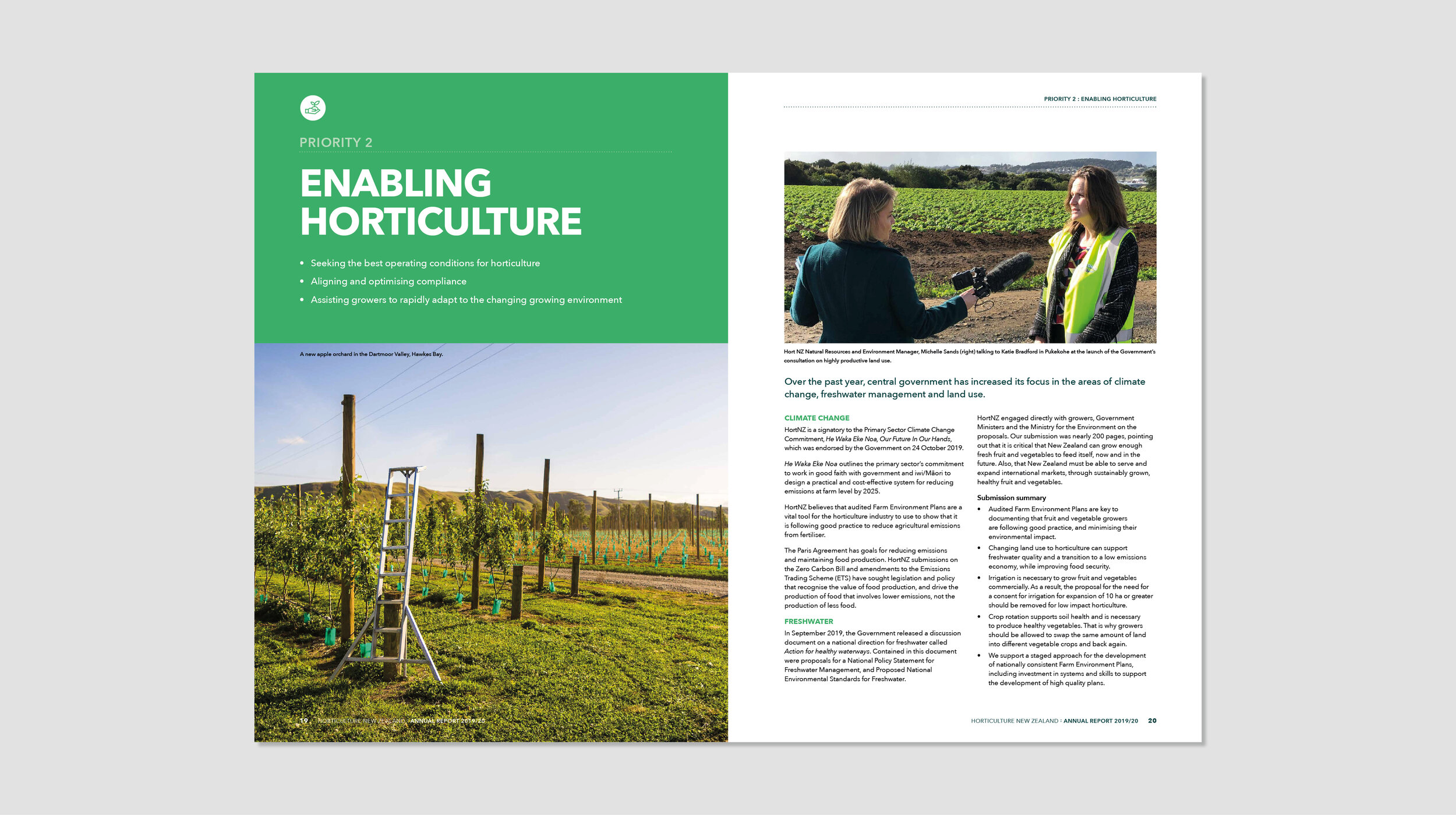
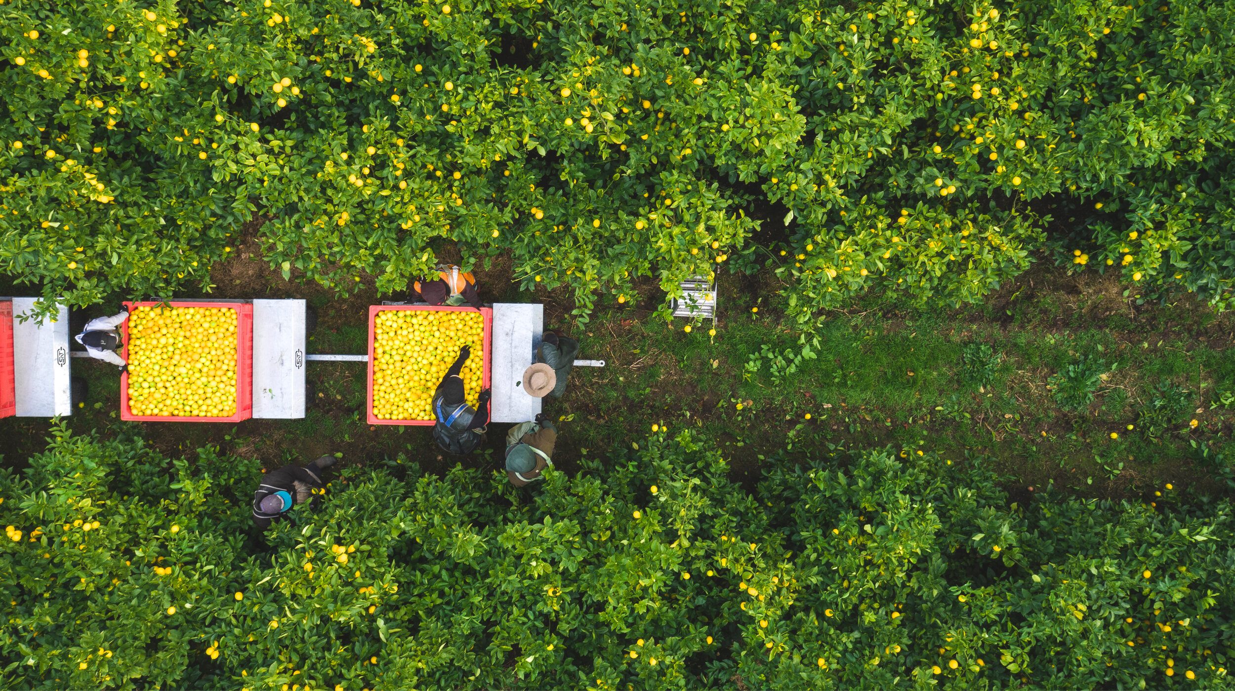
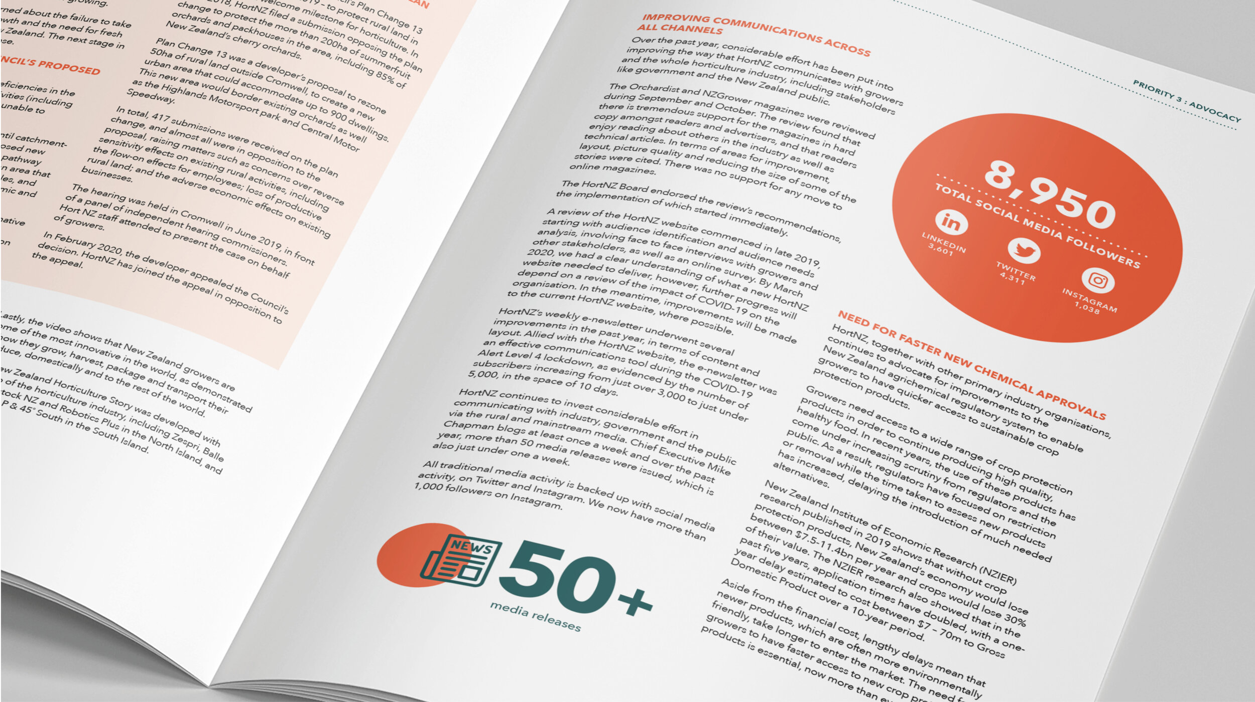
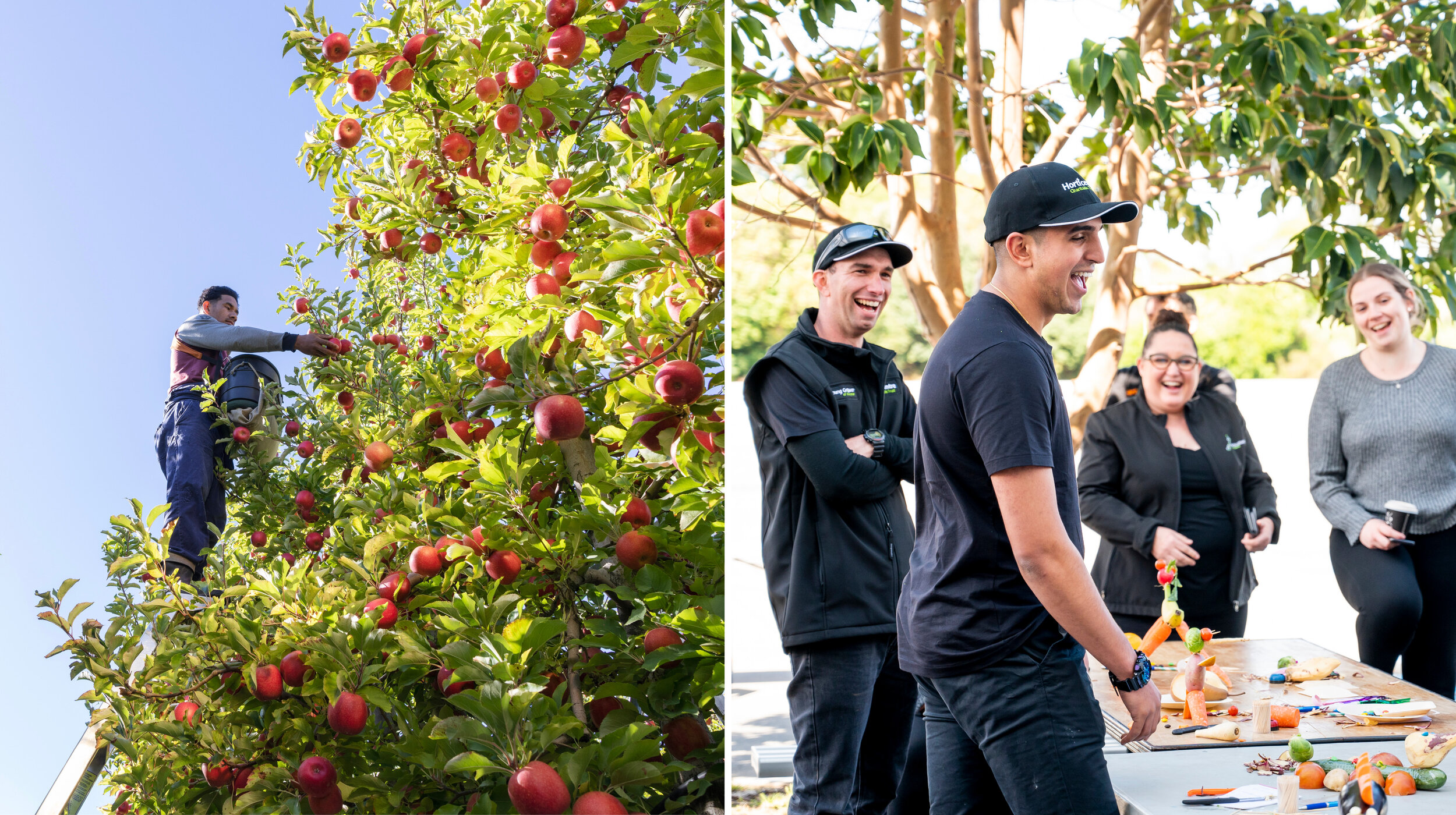
The fresh layout with large, informative stats is supported by vibrant engaging images of real New Zealand growers and workers – the human face that makes the industry so great.
Outcome
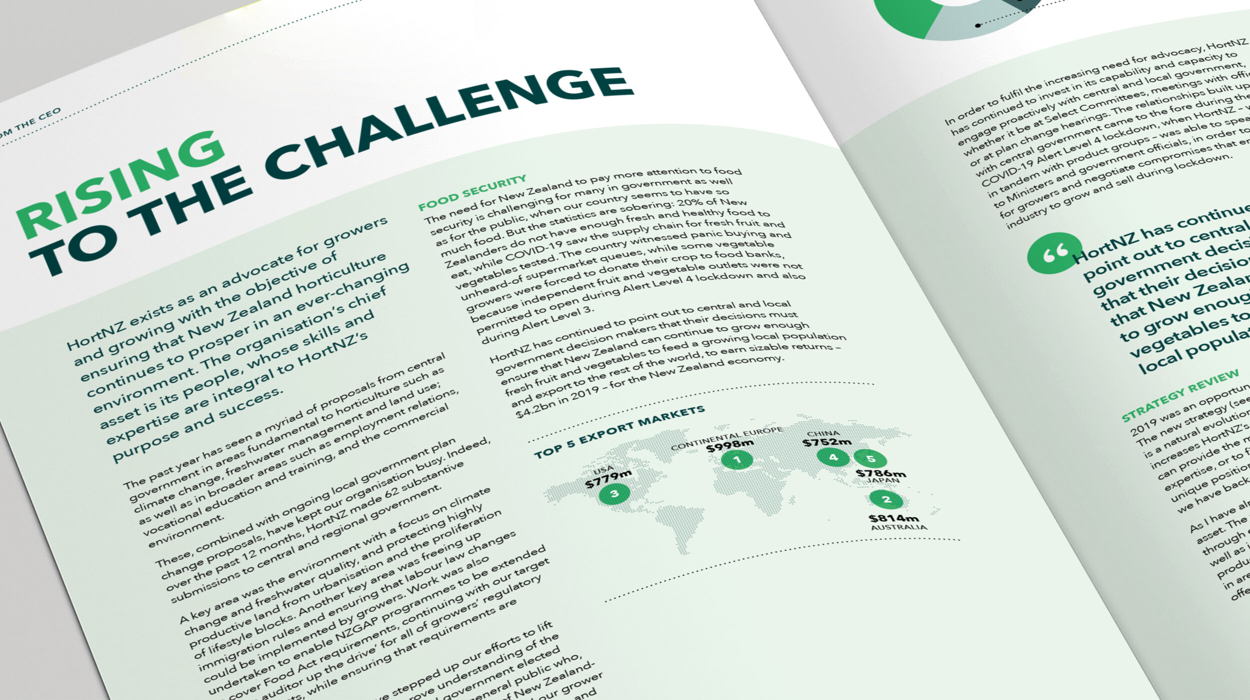
The result was a modern, clean, inviting document that tells the compelling Horticulture story.
The value of the design work invested in the Annual Report extended beyond this project. The Horticulture brand kete also got a refresh – with a review of the colours, fonts, icon styles, photography, and graphic elements (like the circles derived from the logo that are reinterpreted in a number of different ways). The result is a vibrant new look for HortNZ.
