Wellington UniVentures
Brief
To create a new name and visual identity for Viclink, the tech transfer office at Victoria University of Wellington and in doing so to express its unique character – so much more than a tech transfer office. At the same time, the name and identity needed to reinforce the links to the University and to Wellington.
Approach
Two workshops were held with the team to set the foundations for the brand strategy and naming. After a rigorous process – the new name – Wellington UniVentures (WUV) was created. It reflects the strong ties to the capital city and to the university and complements the shift in emphasis in the overarching university brand from ‘Victoria’ to ‘Wellington’.
The brand strategy and the insights from the renaming process then became the brief for the visual articulation of the brand: to reflect a skilled and passionate team that works alongside the University’s researchers to take ground-breaking ideas and inventions and shape them into real-life applications, and that uses the university’s skills and expertise to help deliver positive social change in New Zealand and internationally.
Outcome
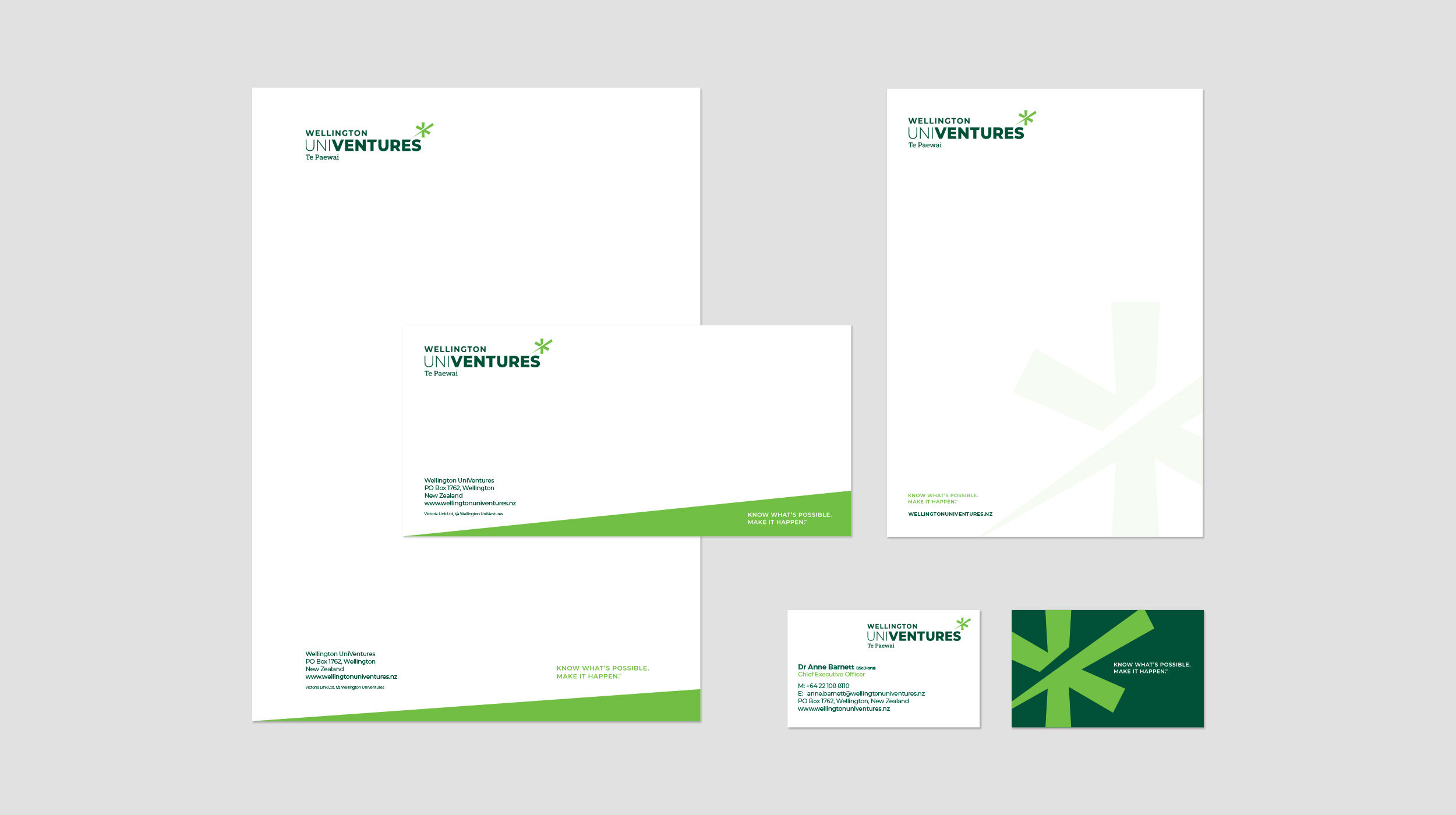
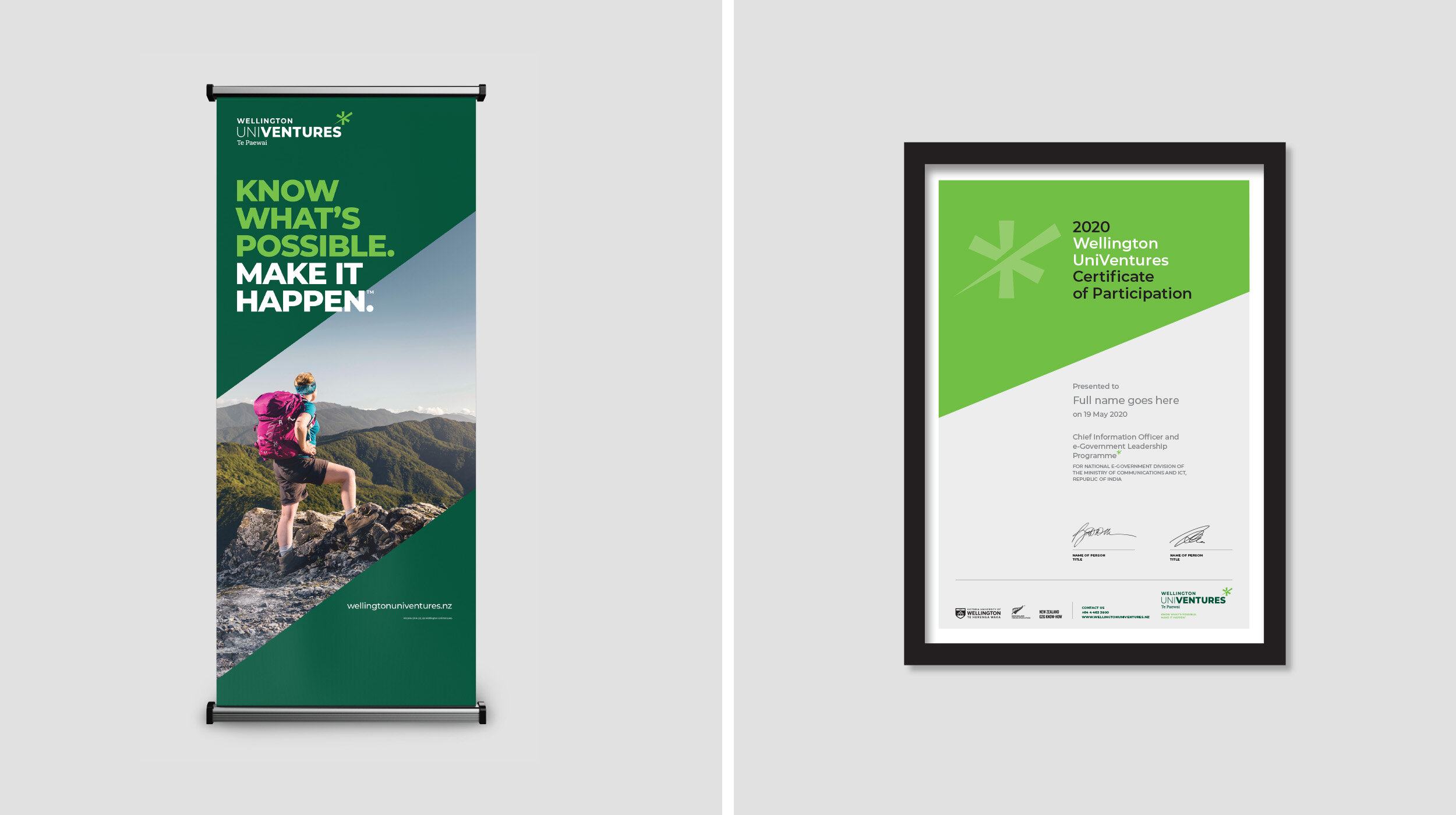
The logo with its ‘shooting star’ device reflects the aspiration and momentum generated by WUV to turn the work of the University’s researchers into economic, environmental and social benefits. The device is also an asterisk – reflecting the added value that WUV brings to the researchers’ work. The starscape background forms a central part of the brand, invoking expansive thinking, limitless potential and scientific endeavour.
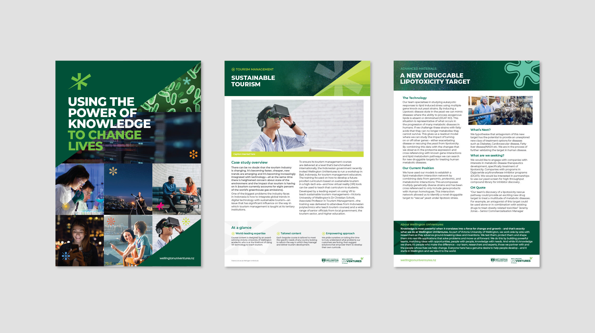
One thing that stood out to us during the process was the amazing WUV team. We chose to express their unique skills and passion by creating a series of ‘supporting’ asterisk devices. Each staff member nominates the device that best describes their area of work, and adds a personal touch by choosing their own colour from the extended secondary colour palette.


